

Thank you! Your submission has been received!
Oops! Something went wrong while submitting the form.
Brand Identity
A rebrand designed for Revived Living, a business where stress management coach, Sam, helped high performing woman reduce their stress through the chaos of what work and life bring.
Description
Revived Living is owned and run by Sam, a stress management coach who helps high performing women develop healthy ways to manage stress, reconnect with their bodies, and cut through the noise that comes with living at the top of your industry. This is precision work for women who have built something remarkable and need support carrying it without losing themselves in the process. This project was created during my time as Brand Strategist at Concetti. All work belongs to Concetti studio.
Process
Sam had been through rebrands before. More than once. And every time she walked away feeling like she had been dropped into a wellness category that was never quite right for her; generalized, softened, and not fully seen. The work she does is specific, powerful, and deeply personal. It deserved a brand that treated it that way. Our job was to build something that finally represented her the way she actually shows up for her clients.
01
Her audience is not just any woman. It is the CEO, the founder, the executive; someone who has fought hard to get where they are and is now navigating the weight that comes with it. Understanding that audience changed everything. The brand could not just represent Sam. It had to speak to her clients too, reflecting their story back at them and making them feel seen the moment they encountered it.
02
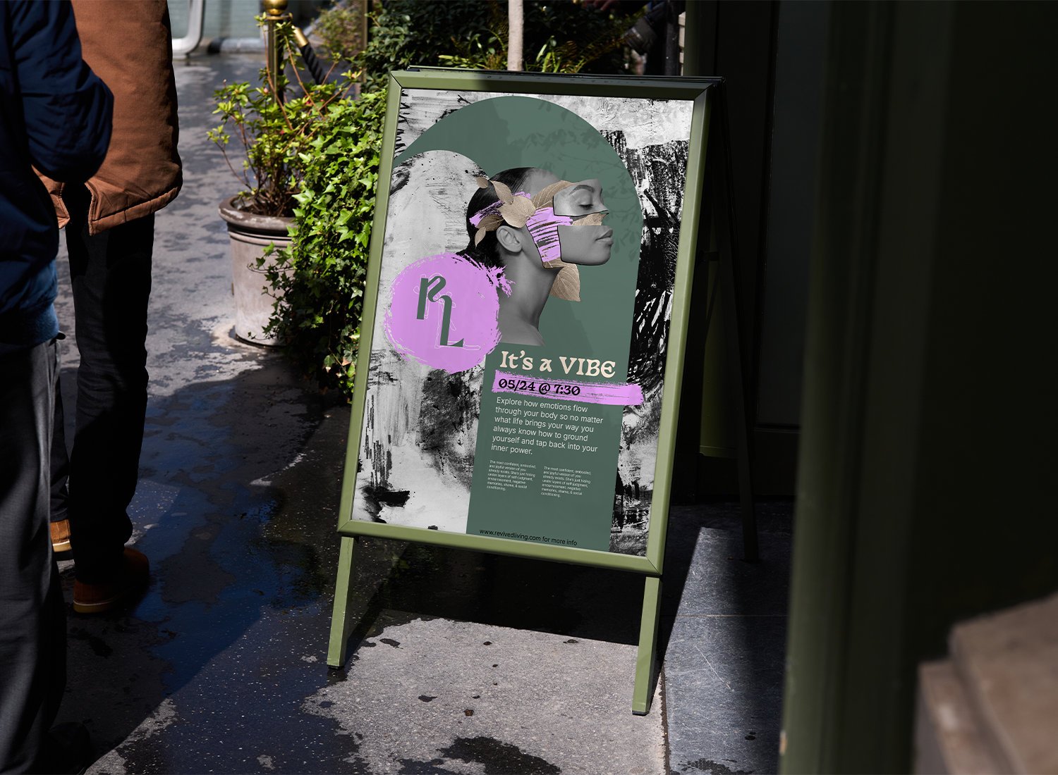
The idea came from two fonts living on top of each other. A perfect, polished serif and a hand written, messy version of the same letters, RL, layered together. That tension is the whole concept. You can hold the vision of who you want to be while also acknowledging the very human, imperfect version underneath. You do not have to choose. Sketchy, textured backgrounds carry that same idea of outer chaos, and the long sweeping shapes pulled from the letters of the logo become something else entirely; areas of calm inside the noise. Safe spaces drawn from the chaos itself.
03
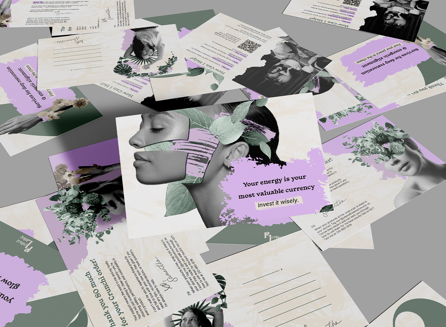
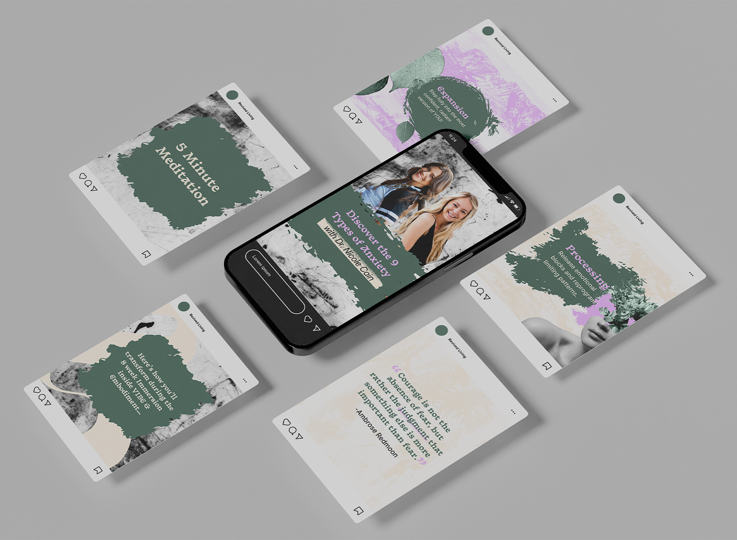
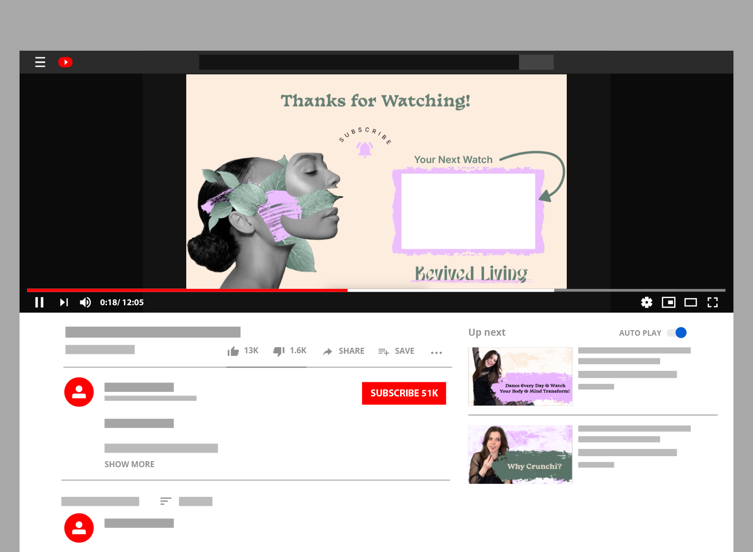
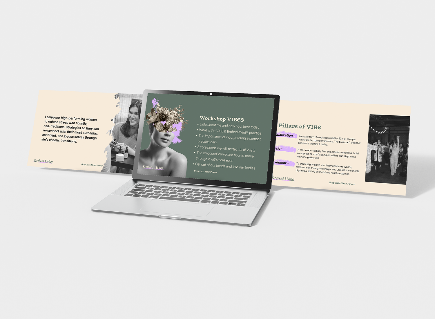
We built out a full brand identity and then kept going. Because a brand that lives only in a guidelines document is not doing its job. Sam needed tools she could actually use from day one, so we designed a full suite of ready to use templates. YouTube intros and outros that carried the brand into her video content. Social media templates built for consistency without killing her creativity. And postcards with empowerment sayings on them that doubled as product inserts; tucked into take home bags so every client left with something that felt intentional, branded, and worth keeping.
04
When Sam saw the brand for the first time she cried. Certain elements brought back memories of difficult seasons in her life, and seeing the beauty that had been made from all of that was something she was not prepared for. That is the moment every project is chasing. When a brand stops being design and starts being something that actually means something to the person it was built for.
05
06